RYAN KAVANAGH
Dia dhuit. Hello. I'm Ryan — a Barcelona based visual designer and crypto trencher. Currently Senior Visual Designer at Revolut. Previously Brand Designer at RichardsDee and a Cannes Young Lions winner.
Over the past 10 years, I’ve helped shape design experiences across brand, marketing, and advertising. Offline, you’ll likely find me indulging in baked goods or dusting off my electronic vinyl collection.
My work has been recognised by IAPI, IDI, and 100 Archive. I hold degrees in Visual Communications and Interior Architecture from MTU (formerly CIT).
Fancy working together? Drop me a line below. Tóg go bog é.
hello@ryankav.com
Barcelona, Spain
41.3874° N, 2.1686° E
100 Archive
Instagram
LinkedIn
RK © 2025
Dia dhuit. Hello. I'm Ryan — a Barcelona based visual designer and crypto trencher. Currently Senior Visual Designer at Revolut. Previously Brand Designer at RichardsDee and a Cannes Young Lions winner.
Over the past 10 years, I’ve helped shape design experiences across brand, marketing, and advertising. Offline, you’ll likely find me indulging in baked goods or dusting off my electronic vinyl collection.
My work has been recognised by IAPI, IDI, and 100 Archive. I hold degrees in Visual Communications and Interior Architecture from MTU (formerly CIT).
Fancy working together? Drop me a line below. Tóg go bog é.
hello@ryankav.com
Barcelona, Spain
41.3874° N, 2.1686° E
100 Archive
RK © 2025
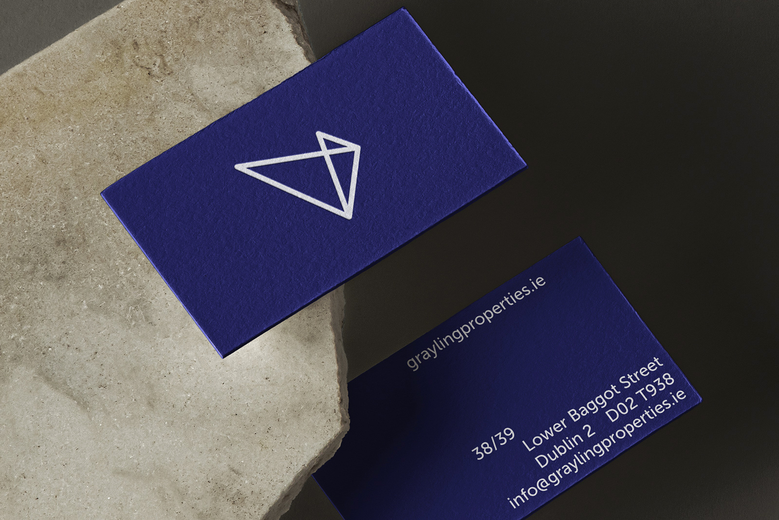
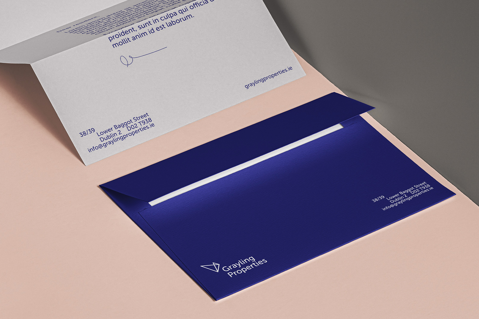
Grayling Properties
Brand design for the residential development company that focuses on re-energising, restoring and letting Georgian properties across Dublin, Cork and Limerick.
I worked closely with the team at Ball&Socket in the naming of this brand, and while intrigued by the proposal to rejuvinate these properties, we explored the idea of rebirth - the phoenix, the triple spiral, butterflies, the lotus, and the sakura, for example.
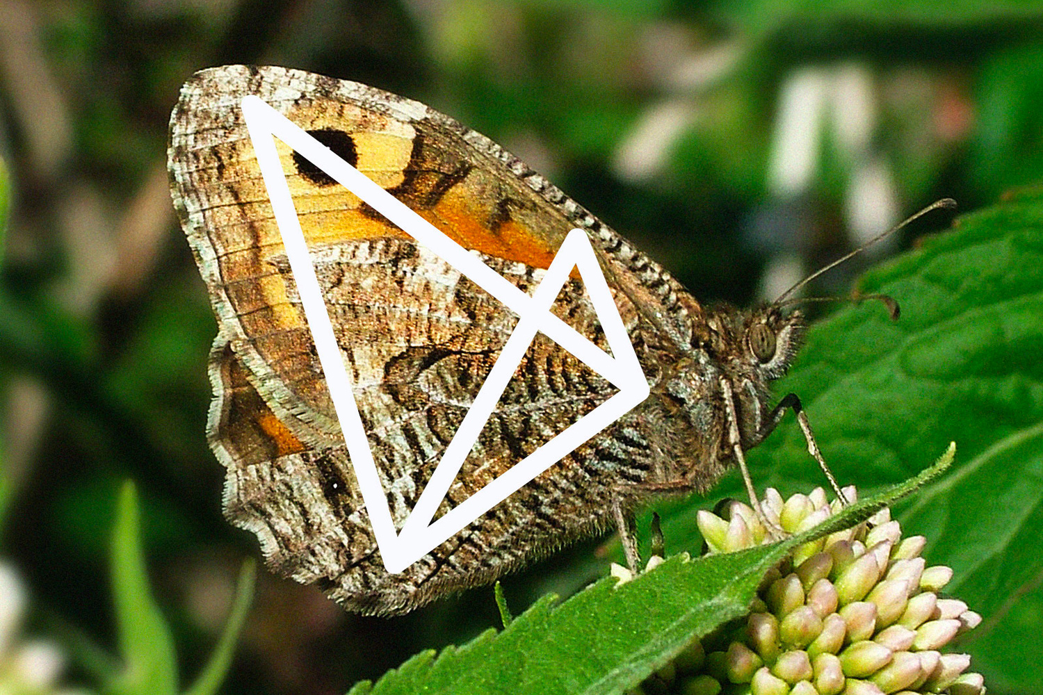
There was something interesting about butterflies. They are a symbol of rebirth (caterpillar to butterfly), they roost together at night for safety (tenants coming home in the evening), feature some really unique colours and patterns (similar to the various types of buildings), and those native to Ireland have some really interesting names, one of which is the Grayling.
After studying the anatomy of a butterfly, I was able to present the Grayling in it's most simplest form, establishing what has become the brand mark.
Studio: Ball&Socket
Year: 2017
︎ Naming, Identity, Guidelines
![]()
![]()
![]()
![]()
![]()
(10)


